A couple years ago, I was asked to paint a logo on the depot floor for the 3 Rivers rambler Train in Knoxville Tennessee. It was painted black and white. It turned out that the white was difficult to keep clean; so I was asked to paint it another color, maybe gold.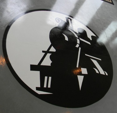
I had several ideas about a pattern of some sort. My reasoning was that a pattern would hide dirt better that a solid color. Finally, I settled on the idea of radiating gold lines between sunset colors. I tried to make the colors translucent, so the gold paint would show through them, but that happened with limited success.
The first coat of paint I used was the same paint I used outdoors on the John Henry Tribute locomotive. It was One Shot brand metallic brass. It looks good outdoors, but indoors it was a bit too orange. I think the reason is that it’s not brass powder in a clear binder, but aluminum powder in a colored varnish. I will say that it handles and goes on nicely, but I wanted a different look. So I used a formula I’ve only used once before; I mixed real brass powder into clear varnish. It has more luster, and a truer color.You can see the difference in the two colors in the first picture. The colors change with the angle of view, but this gives you some idea. The color I mixed is closest to the black. The roughness in the finish is an anti slip additive.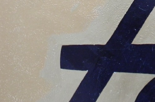 Here’s the brass powder that I used. It’s expensive, but I have a lot left over for other projects.
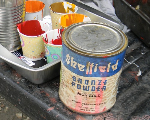
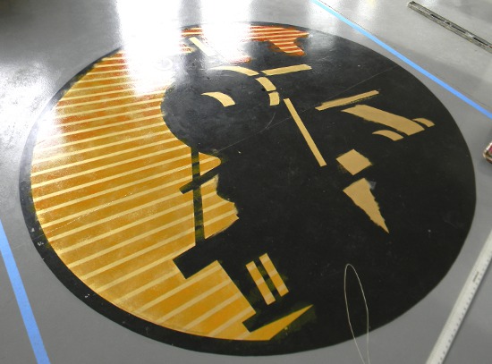
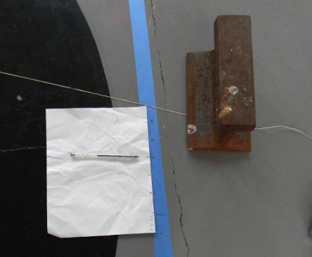
Next, I laid wide blue tape on the floor on two sides of the logo. In the first picture, you can see where I’ve stretched a string so that it is aligned with one of the perspective lines in the locomotive. I marked both pieces of tape where it crossed. I did that again with the other perspective line that is near the first one.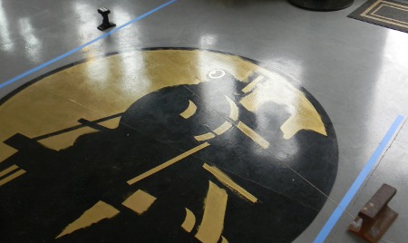 After I had two marks on the front side of the locomotive, where the lines would be widest; I laid down pieces of thin tape as a guess how many lines I wanted in that amount of space It was six, so I divided the length between the two marks by six, to get an exact width of each line. I put those six marks on the tape, and did the same on the other piece of tape. Next, I made an improvised ruler, really just a way to repeat the pattern.
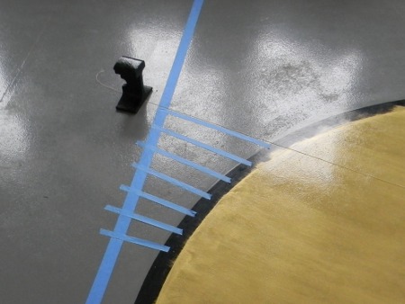
 I used the marks on the two pieces of tape to guide where the string should be stretched for each line. Each time I moved the string, I made small pencil marks on the gold paint, to know where the lines went. Next, I used a straight edge to mark long lines on the gold. I wasn’t sure whether I would use a fine line sharpie to outline each painted line; so I made the guide lines very precise, using the backside of an Exacto blade. Basically, I scribed the lines into the paint, rather than using some sort of pencil. As it turned out, that was OK, but it could have been a disaster. What might have happened is that the gold paint was now sliced, and would lift as I removed the thin blue tape. thank God it didn’t happen, but I should have thought about that first.
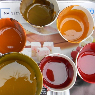 The picture above shows the colors that I used, they are far less opaque than they appear. they all have clear varnish, alkyd glaze, One Shot brand hardener, and turpentine added. I was hoping that the gold would show through a little. The brown at the top was only to dull the hue of the other colors. The larger can at the bottom was the yellow glaze color. I applied it first, over an area about 2 square feet, with a sponge. I wanted it to have the textured apperance that a sponge imparts.. After that, while it was still wet, I sponged on the other colors, not too evenly. I started with the yellow-orange, then worked my way to the darkest red. The reason being that a lighter color would blend far more easily into a dark one, than the other way around. In other words, the darker color would stay in the sponge worse , and I would have less control. The next picture shows it before I redid the black; the last two pictures are the finished work, one with different lighting.
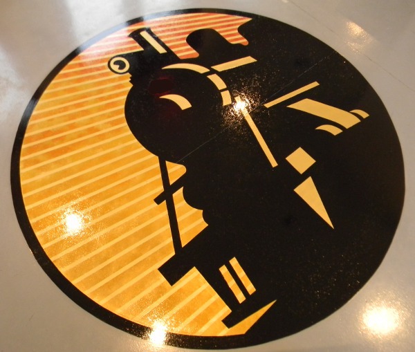
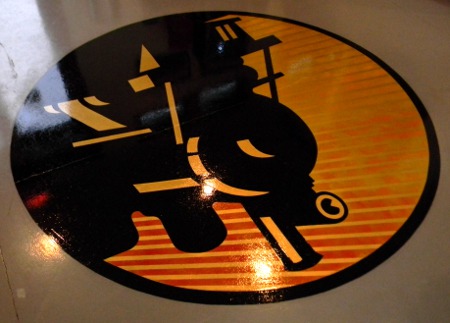