You are hereOneida Caboose interior restoration work
Oneida Caboose interior restoration work
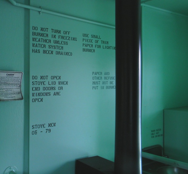
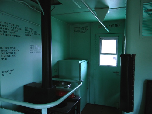
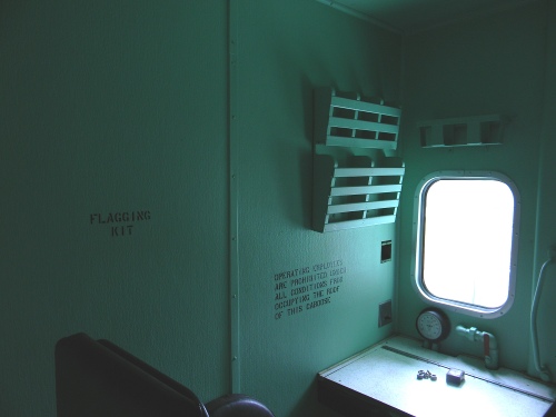
I did lettering in 19 places inside the caboose. Figuring out what all the lettering originally said was difficult, so the owner said to do the best I could. I think I figured most of it out. There is one place, a set of switches (same type used for turning on residential lights) that had small lettering next to it; I didn't figure out what it said. The rest of the lettering took long hours of reexamining photos from 3 sources. One is pictures that were sent by the manufacturer, another is color photos taken after the cabooses were in service, and the third is an out of print book written about the same caboose model used by the Union Pacific Railroad. What's interesting is that the first group has pictures that are in the group from the book, and some that the book doesn't have; and, the reverse is true. The group from the book has most in common with the first group, and a few it doesn't have.
The difficulty comes from the pictures being taken to show what the caboose interior looked like, not what the lettering said. The pictures are old, grainy black and white reprints with dark shadows in the corners near the ceiling. But with enough comparing, I think I discerned the original copy. In one place, it wasn't comparing photos, but reasoning: I was baffled by an incomplete picture of lettering on the end walls, near the door. One one end, this location is inside the toilet room. What I could see was small letters that appeared to say: “...D OFF GREEN”. The lettering was very grainy, so I couldn't be sure of even that much. Later, I was looking at the pictures from the book which showed the exterior end of the caboose. The caption said something like:”Notice the marker light in the red position”. Then I realized that the words were probably “RED OFF GREEN”; because the location of the lettering was exactly related to where the marker lights are on the outside; the wiring from the 3 position switch to the lights being short. As it turns out, this caboose is the same model CA-11 used by the U.P., but this caboose was configured for different service, and didn't have the same marker lights. I only discovered this when I went back out to apply the letters.
With the pictures being at an angle, and not clear, I couldn't do my usual routine of making vector letters over those from a picture; so I used the Phantom Stencil font. Please note: I think that my lettering is larger in some places than the original, but can't be sure. One of my main ways of calculating letter height was the metal plaque just to the right of the large metal panel behind the stove. It is still in the caboose, so I measured it, and made lines following the perspective of the top and bottom of the plaque. These lines were made in a vector editing program, with the picture imported. I ran the lines to the right, where the lettering is in the photos. At the time, it looked like the lettering was 1 inch tall, but now I'm wondering if .75 inch tall would have been better. It arranges OK for height, but the width looks too wide. That might be explained by font differences.

The original lettering was done with stencils, and probably spray paint. Making actual (oil board?) stencils would have added expense, and since I knew that there were already overall inaccuracies, I used paint mask stencils cut on my plotter. Another consideration is that the paint mask has the potential for very clean results. It's possible, even likely, that the original stencil lettering was applied with a stencil brush, not spray paint, that application would also leave no over spray.
There was however, a big difficulty with the use of paint mask. The surface is a textured plastic, maybe part of the sound deadening effort. By the time I got to doing the interior, the season had changed, and the air was cooler. Paint mask is very susceptible to colder temperatures, the characteristics change. It isn't as flexible, and it tears upon removal. The rigidity made it not conform to the surface texture, until I heated it quite a bit. Even then, there was a lot of touch up where the black paint bled under the mask. Another big factor is that the wall paint is low luster, which is much harder for the mask to adhere to.
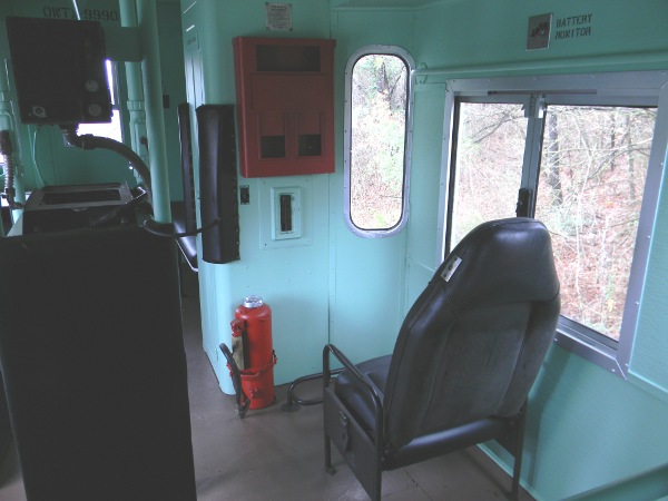
In the end though, the results are very clean. As mentioned on a previous page, I plan on making large pictures and vectors available on line. Here are some small pictures I took after the interior lettering. Another note: I only did the lettering, not the interior painting, which was nicely done.


